Painting
Watercolor Painting
|
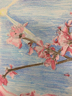
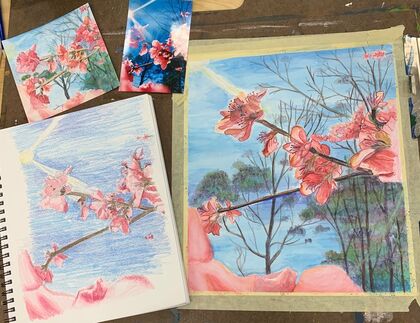
Watercolor sketch
|
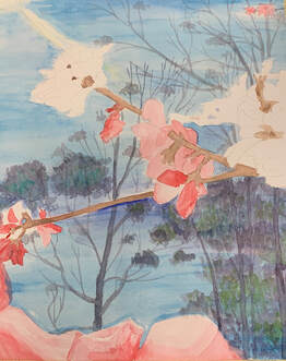
Watercolor WIP
Watercolor WIP
|
|
All pieces
|
|
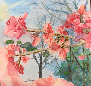
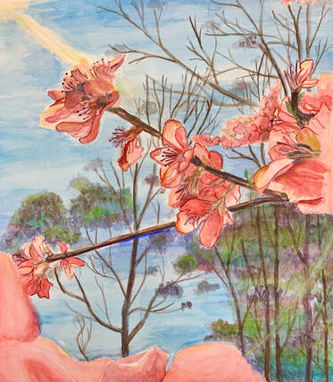
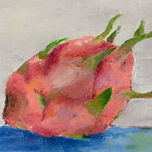
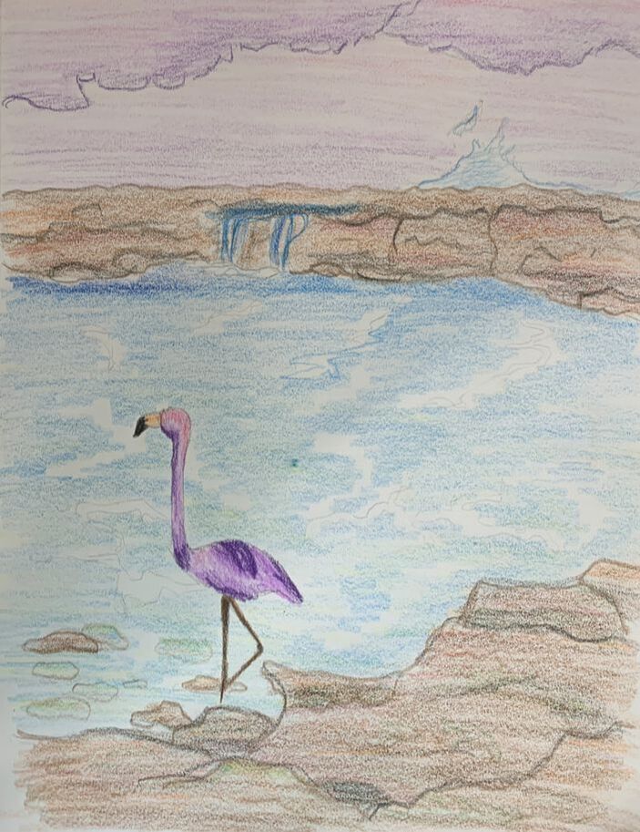
Watercolor Painting Final
Watercolor Critique
1. What watercolor techniques proved to be effective in your painting? How and
Why?
Layering, wet-on-wet, gradient, and dry brushing were techniques I used in my
painting. To get a certain shade of pink, I had to layer the colors many times to get
exactly what I wanted. For the shadows of certain petals, I used a dry brush with
some red to add depth. In the background, I used one shade of blue, but I blended it
out so some spots were lighter than others in a type of gradient. For most of my
piece, I used wet-on-wet by either just putting water on the paper before adding
another color or adding new colors when the previous layer was still wet.
2. How important was using transparent layers in your painting?
Using transparent layers was very important to make sure the colors were the correct
shade. When the paints were watered down, they weren't as bright as I needed
them to be. To get the hue I needed, I had to layer on multiple shades of the color.
I also mixed colors as I layered, so the petals of the flowers weren't the exact same
color all the way through.
3. Explain how your composition was successful. Did you utilize all the elements
of art and principles of design? Explain.
The seven elements of art are line, shape, space, value, form, texture, and color. The
principles of design are emphasis, balance and alignment, contrast, repetition,
proportion, movement and space. I believed that all of the elements and principles
can be seen within my piece. The lines I added to the branches made them stand out
and gave them texture while also repeating the same pattern. I utilized space when
I painted the petals and layered them in order to create depth.
4. Was color choice an important factor in the overall success of the painting?
Why?
The colors I chose for the painting were very important. I wanted them to be bright
and vibrant so they could draw the eye to the piece. I wanted the brilliance of the
colors to make the painting more enjoyable to look at and to create a happy vibe.
5. Describe your craftsmanship.
I started with a bright blue background; layering the hues to create a gradient. I left
the paper blank so I could paint in the petals without accidentally making them
purple. I kept layering different colors to create the exact hue that I wanted.
6. If you were able to do something different, what would it be and why?
If I was able to do something different, I would probably choose a different picture.
I would pick one with more colors and without the sun in it. I still enjoyed painting
this piece, but there weren’t as many different colors as i would have liked. Next
time, I might pick a sunrise so I can catch the colors of the clouds and sky changing.
7. Explain to me what you have learned about watercolor and how it has
improved or discouraged your development in art.
Before this class, I didn’t know that I should always mix colors and not just using
them as they are. I was also not aware of the fact that I was supposed to paint the
colors in thin, transparent layers to avoid creating puddles and over-working the
paper. I didn’t love working with watercolors due to the fact that you can’t easily fix
mistakes and lighten up the colors. I prefer acrylics, but I still enjoyed creating this
piece.
Hundertwaasser V.S Klimt
|
|
|
Acrylic Project
|
Colored Sketch
|
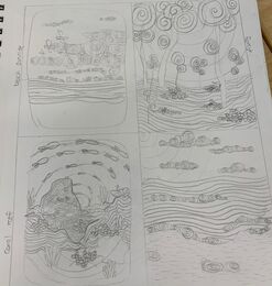
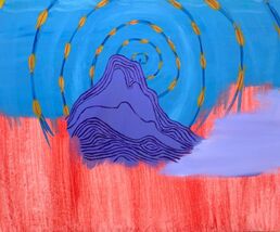
Acrylic Final
Acrylic Painting
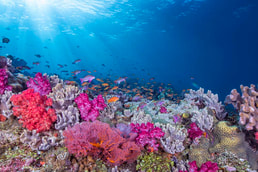
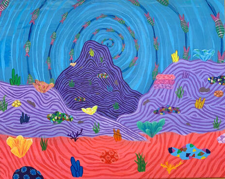
1. Describe the craftsmanship of your painting. (Is it neat and well executed?)
I believe that the craftsmanship of my painting is pretty clean and everything was
thought out. It took a very long time to paint the lines on the background that
the coral was on. I had to make sure that the lines were roughly the same distance
apart from each other and that you couldn’t see the canvas through the brush
strokes.
2. How does your work embody the artist’s style?
My work was loosely based off of Hundertwasser’s style. His painting contained
many flowing lines and repeating patterns. I used bright colors, like he did, and
you can see many of the same types of corals throughout my painting to bring the
look together.
3. Describe your choice of colors/color harmonies and how you
used them throughout the artwork.
I chose a wide variety of vibrant colors to use in my painting. I didn’t use a
specific color scheme because I wanted to make my piece brightly-colored.
Every specific type of color harmony only contained a few shades and I didn’t
think it was enough.
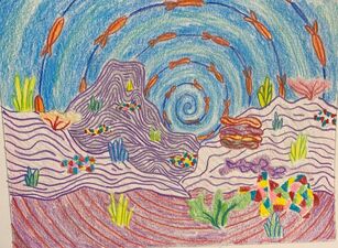
4. What is the emphasis (focal point) of your artwork?
My emphasis of my painting is the very center. I had a spiral coming out of the
middle of my piece and placed fish around the rings so it gave the illusion that
they were swimming in a protective circle. The spirals lead outwards and draw the
eye to the coral and other aspects of my painting. I think all the bright color is
also a focal point of the entirety of my artwork.
5. How did you use textures and patterns to embellish your
artwork?
I used a lot of lines to give certain objects depth and texture and repeating types
of corals throughout my painting to give my piece an overall pattern. Using a
small paintbrush, I created fine strokes to make the smaller details of my painting.
6. How did you put a border on your artwork? How does it enhance
the work?
My final actually didn’t have a border, instead, I had a spiral. This was the main
focal point of my work and kind of drew the eye to the center of my piece and then
outwards. I think that if I had added a border, it would have made my painting
stand out a bit more, but I wanted the piece to be a little bit more loose and free.
7. Describe any difficulties you had creating this artwork.
One of the main difficulties I had was making my piece look abstract. I’m used to
more realistic pieces, and it was a challenge to make my painting look like
Hundertwassers. Just by using many different shades of color and repeating
patterns, I managed to make my piece look less realistic. Finding and choosing the
right colors for my painting was also a difficulty. I didn’t know exactly what colors
I wanted to use for the fish or coral, and it took me a while before I found the
shades I ended up using.
I believe that the craftsmanship of my painting is pretty clean and everything was
thought out. It took a very long time to paint the lines on the background that
the coral was on. I had to make sure that the lines were roughly the same distance
apart from each other and that you couldn’t see the canvas through the brush
strokes.
2. How does your work embody the artist’s style?
My work was loosely based off of Hundertwasser’s style. His painting contained
many flowing lines and repeating patterns. I used bright colors, like he did, and
you can see many of the same types of corals throughout my painting to bring the
look together.
3. Describe your choice of colors/color harmonies and how you
used them throughout the artwork.
I chose a wide variety of vibrant colors to use in my painting. I didn’t use a
specific color scheme because I wanted to make my piece brightly-colored.
Every specific type of color harmony only contained a few shades and I didn’t
think it was enough.
4. What is the emphasis (focal point) of your artwork?
My emphasis of my painting is the very center. I had a spiral coming out of the
middle of my piece and placed fish around the rings so it gave the illusion that
they were swimming in a protective circle. The spirals lead outwards and draw the
eye to the coral and other aspects of my painting. I think all the bright color is
also a focal point of the entirety of my artwork.
5. How did you use textures and patterns to embellish your
artwork?
I used a lot of lines to give certain objects depth and texture and repeating types
of corals throughout my painting to give my piece an overall pattern. Using a
small paintbrush, I created fine strokes to make the smaller details of my painting.
6. How did you put a border on your artwork? How does it enhance
the work?
My final actually didn’t have a border, instead, I had a spiral. This was the main
focal point of my work and kind of drew the eye to the center of my piece and then
outwards. I think that if I had added a border, it would have made my painting
stand out a bit more, but I wanted the piece to be a little bit more loose and free.
7. Describe any difficulties you had creating this artwork.
One of the main difficulties I had was making my piece look abstract. I’m used to
more realistic pieces, and it was a challenge to make my painting look like
Hundertwassers. Just by using many different shades of color and repeating
patterns, I managed to make my piece look less realistic. Finding and choosing the
right colors for my painting was also a difficulty. I didn’t know exactly what colors
I wanted to use for the fish or coral, and it took me a while before I found the
shades I ended up using.
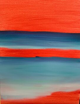
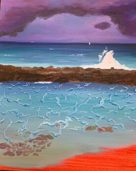
Oil Painting
|
Palette Knife
|
Brush
|
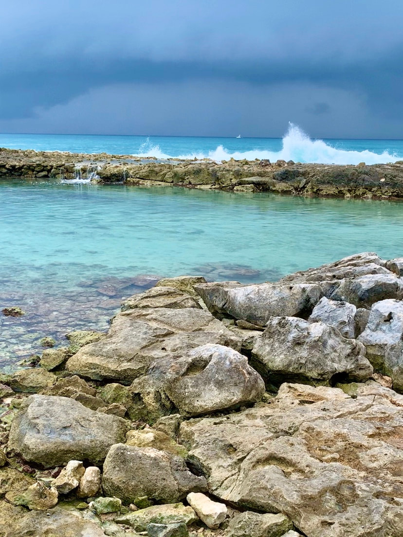
Landscape References
|
|
|
In-progress Pictures
|
|
|
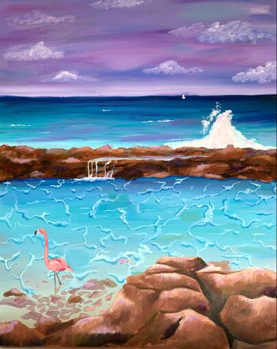
Oil Landscape Final
Oil Critique
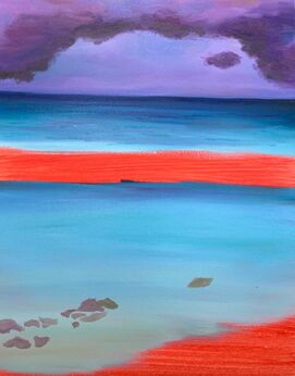
Describe the craftsmanship of your painting. (Is it neat and well executed?)
I feel like my craftsmanship is a bit messy, but is still well executed. This was my first
time working with oils, and my brush strokes were loose and not very neat. I thought
it would add more texture to the rocks and clouds, and I liked how my piece turned
out.
Describe your choice of colors/color harmonies and how you used them
hroughout the artwork.
I used almost all cool colors in my painting. My reference picture was mostly shades
f blue, but I decided to make the sky purple and the rocks more colorful. I love the
cool colors because it makes me feel relaxed and makes me feel like I’m at the beach.
I brought the purple from the sky and reflected the color onto the rocks and a little
in the water.
How did you create contrast in your painting?
The horizon line between the sky and the water has a sharp contrast due to the
change in the colors and the clean cut line between them. You can also cleanly
distinguish each piece of my painting because it’s separated by water, rocks, or sky
in every section. The color change is the most obvious contrast in my artwork.
How did you apply textures, highlights and shadows to enhance your artwork?
Using thin brush strokes and stippling, I created texture for the rocks. To give the
water some character, I added the sea foam from one of my reference pictures. For
highlights, I typically used a pale purple, to make it look like the color from the sky
was reflected onto the water and rocks. For shadows, I used various darker shades.
How were you able to create depth in your painting?
By adding shadows and a lot of layers to my painting, I was able to create depth
and made some aspects of my piece look 3D. Highlighting the parts where the
natural light would strike and adding a little purple to reflect the sky (as stated
in a previous question), also gave my painting a more realistic loo.
What painting techniques did you use that made your painting successful?
For the rocks, I actually started to paint them upside down to get the shapes down
before I turned my painting right side up to add details. It was easier to paint the
outline of the rocks upside down because it made me focus on the actual shape
and not my own idea of what rocks should look like.
Describe any difficulties you had creating your drawing and what you could do
to improve your drawing?
The only part I had trouble with my drawing was getting the colors right. I didn’t
have a lot of time to work on my sketch because I wanted to get right to painting,
so I didn't take as much time as I should have. My pencil marks were very visible
and the colors weren't vibrant in my drawing.
Explain the successes you had with this painting.
I'm really happy with how my piece turned out. At first, I was unsure if I liked it
or not, but once I changed the sky it really changed my painting. Originally, I had
a bank of clouds, just like my reference picture. I ended up changing that to a
normal sky, still purple, but this time with only a few clouds across the sky.
Pet Portrait
|
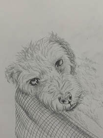
Sketch
|
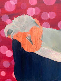
Work in Progress
|
Work in Progress
|
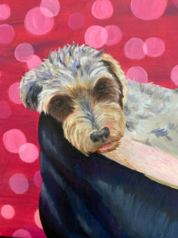
Final
Reflection Questions
For this critique I first want you to discuss your painting. Use your own words to
describe, analyze, interpret and judge your artwork. Add art vocabulary to make
your critique better. There are no questions to guide you so you need to be as in
depth as possible.
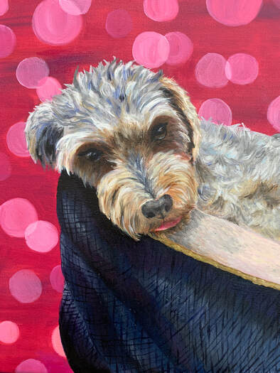
Since this is only my second oil painting and my first pet portrait, I’m really happy
with how it turned out. I honestly loved painting this piece, even though the fur and
details were painstaking. I had to use warm greys and cool greys to get the contrast
of colors without straying too far away from the original hues.
Discuss how accomplished value, texture, layering, blending, contrast and realism.
What is the most important aesthetic quality of your painting? If you are unsure
what aesthetic means then look up the meaning and write it with your critique.
I had to use a lot of layers to make the fur looked textured and using different tints
and shades of grey to create the look I wanted. I really love the bokeh and I feel like
it’s very aesthetic and kind of calming. I think it brings the piece together and adds an
appealing background without taking away from the dog.
Explain your creative process. Discuss how you used techniques learned in class
to create a successful painting.
As I stated before, I used a lot of layering to create my piece. I also used liquin a lot to
thin out my paint in order to make my brush strokes thinner. The fur on his body was
a lot harder to paint than his head because In my picture, it was kind of blurred out. I
had to infer what a higher quality picture of his fur would look like and how the colors
would look, so that was a little difficult.
Reflect your growth through the project.
At the beginning of the project, I didn’t exactly understand how many colors I would
have to use to create the fur. I also wasn’t expecting the details would be that difficult,
but I soon understand how wrong I was. I quickly learned that mixing a bit of liquin
in with my paint thinned it out and made it easier to paint thinner strokes. As I painted,
I kept adding more and more layers, went back to do shadows, then painted more fur
over top and did highlights.
Discuss craftsmanship and quality of your painting.
I think the craftsmanship of my piece of work is pretty good and well put together. It
took me a while to get the details right, but I eventually got it down. Practicing fur on
the canvas paper before I started working on my final piece helped a lot. As I
continued working on my painting I improved with making the fur and eyes look life-
like.
describe, analyze, interpret and judge your artwork. Add art vocabulary to make
your critique better. There are no questions to guide you so you need to be as in
depth as possible.
Since this is only my second oil painting and my first pet portrait, I’m really happy
with how it turned out. I honestly loved painting this piece, even though the fur and
details were painstaking. I had to use warm greys and cool greys to get the contrast
of colors without straying too far away from the original hues.
Discuss how accomplished value, texture, layering, blending, contrast and realism.
What is the most important aesthetic quality of your painting? If you are unsure
what aesthetic means then look up the meaning and write it with your critique.
I had to use a lot of layers to make the fur looked textured and using different tints
and shades of grey to create the look I wanted. I really love the bokeh and I feel like
it’s very aesthetic and kind of calming. I think it brings the piece together and adds an
appealing background without taking away from the dog.
Explain your creative process. Discuss how you used techniques learned in class
to create a successful painting.
As I stated before, I used a lot of layering to create my piece. I also used liquin a lot to
thin out my paint in order to make my brush strokes thinner. The fur on his body was
a lot harder to paint than his head because In my picture, it was kind of blurred out. I
had to infer what a higher quality picture of his fur would look like and how the colors
would look, so that was a little difficult.
Reflect your growth through the project.
At the beginning of the project, I didn’t exactly understand how many colors I would
have to use to create the fur. I also wasn’t expecting the details would be that difficult,
but I soon understand how wrong I was. I quickly learned that mixing a bit of liquin
in with my paint thinned it out and made it easier to paint thinner strokes. As I painted,
I kept adding more and more layers, went back to do shadows, then painted more fur
over top and did highlights.
Discuss craftsmanship and quality of your painting.
I think the craftsmanship of my piece of work is pretty good and well put together. It
took me a while to get the details right, but I eventually got it down. Practicing fur on
the canvas paper before I started working on my final piece helped a lot. As I
continued working on my painting I improved with making the fur and eyes look life-
like.
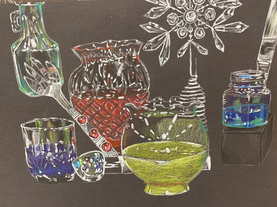
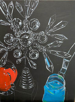
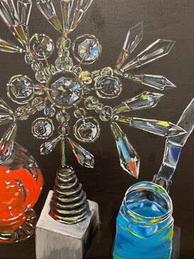
Glass Still-Life
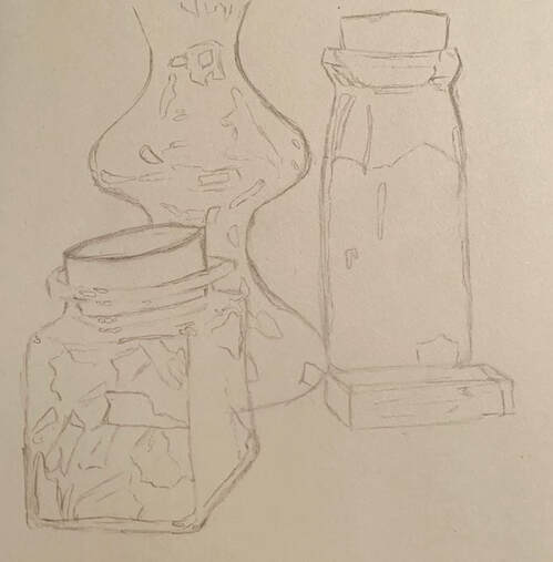
Composition Sketches
|
Sketch of all pieces
|
Painting Glass, Practice
|
|
Final WIP
|

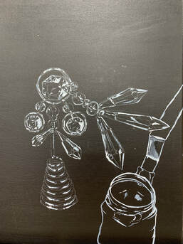
Final Piece, done
Critique Questions
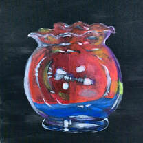
Overall, I'm pretty happy with how this piece turned out. It was very challenging and
took a lot of time to do. I got frustrated when I was painting the white outlines and
highlights because they weren't looking the way I hoped. When I stepped back
though, I was able to see where I needed to improve and I ended up the way I wanted.
I was unsure about adding color, but from a distance I think it looks pretty realistic.
This was my first still-life painting I've done in a while, and this class has really
helped me understand value and shading. I didn't use any black paint other than
the background, so all the depth was created with white oil paint. In places where
I needed shadows, I either left it black, or I just thinned up the white paint with
liquin. Painting all the colors in the crystals was hard because there were so many
different shades of grays, yellows, and blues in each piece. I had to rush to finish this
piece because I didn't want to be behind in class, so I might touch up some details
and clean it up later so I can use this for my college portfolio.
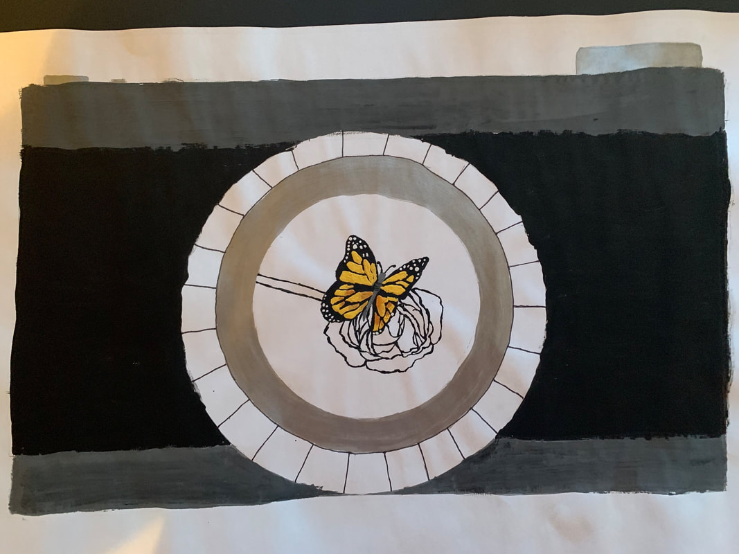
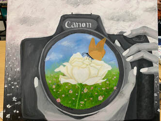
Choice Piece
Reference
|
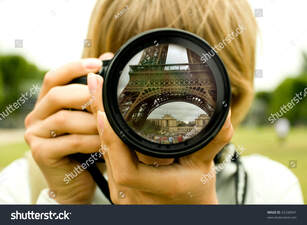
Reference
|
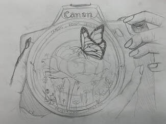
Sketch
|
WIP
|
WIP
|
|
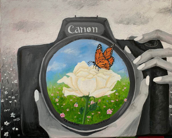
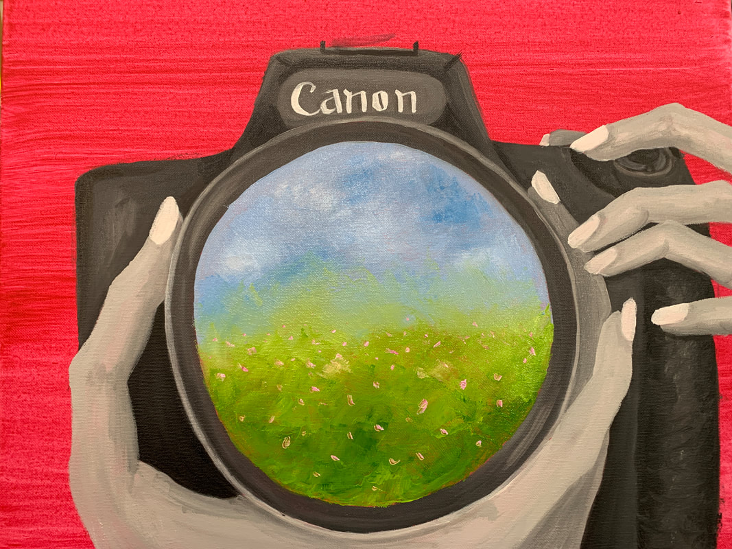
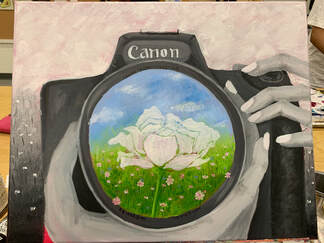
Finished Piece
Painting Critique
I had a few ideas on what my free-choice painting could be, but none of them I really loved. Then I heard someone say that they were going to do a re-paint and I remembered a piece I did 3 years ago that I really wanted to re-do. It was a black and white camera with a butterfly sitting on a white rose. I painted that 2 years after my cousin passed away and it was kind of a memorial for her. She loved photography and at her funeral we had white roses and released monarch butterflies so I wanted to try to capture that memory in a painting. I liked how the sketch I made turned out, so I decided this was going to by my final painting for the class. Doing the background was probably one of the hardest parts of the painting because it took a lot of coats to cover up the red wash. I wanted to do the hands, camera, and background in black-and-white so that the reflection in the lens would stand out. The hands were also extremely hard to paint because I already struggle with drawing hands, so painting them on a bigger scale was a struggle. I had to fix them 3 different times but in the end, I think they turned out ok. I really enjoyed this final project because there weren't any real guidelines so I had the freedom to do what I wanted. I didn't love how the painting turned out, but I like the idea and had fun creating it.
