AP Art
Sustained Investigation: Holidays personified
Schedule: https://docs.google.com/document/d/1gcF9Fvl1V-ytqOQFDYX0rjcOmaerfGCw9OoDEej5kvM/edit?usp=sharing
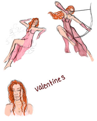
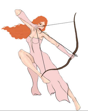
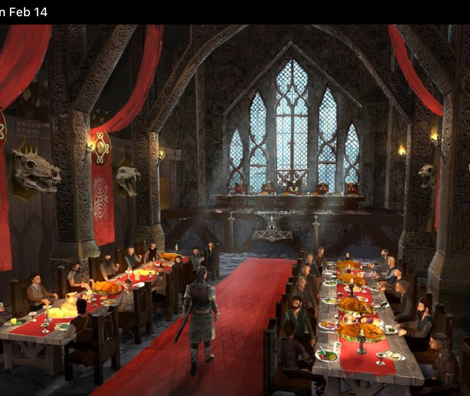
Valentines Day
|
|
|
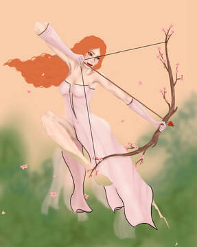
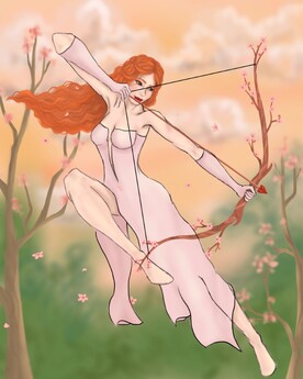
First Piece
|
|
|

|
I wanted to draw Valentine's Day as a soft girl, but still showing her strength. I drew her shooting a bow, similar to Cupid, since he's a symbol of Valentine's Day. I used warm colors to give the drawing somewhat of a renaissance vibe, but I made the background blue in order for it to stand out against the background. I typically draw my characters in more tight fitting clothes, but I liked the idea of her wearing a flowing dress. Originally, she was going to be barefoot, but I saw a post on pinterest of laced up riding boots, so I incorporated them into my drawing.
The hardest part of this piece was the color palette, since I was using a warm color scheme, but then changed the background to blue. Overall, I like how this piece turned out, but I might go back in and make a few changes, like making the dress flow in the direction of the hair (which I just noticed). |
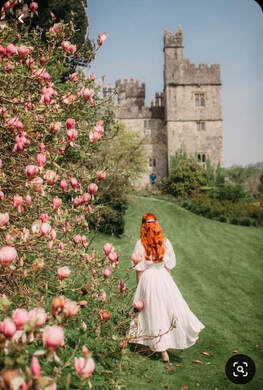
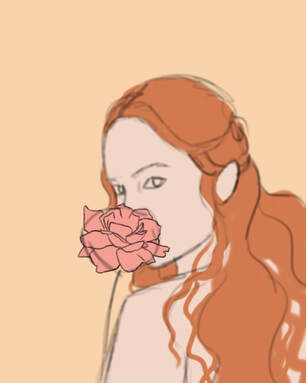
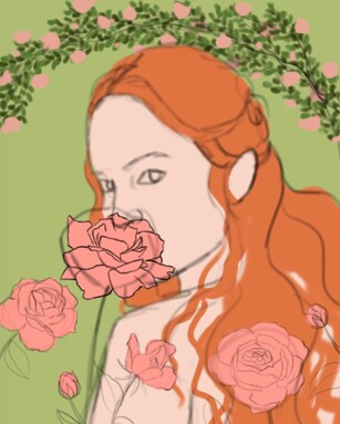
Second Piece
|
|
|
|
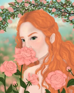
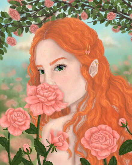
I wanted to keep the warm vibes and I decided to put Zara in a rose garden since roses are a symbol of Valentine's Day. I had an idea to place her in front of a cherry blossom field and bring the cherry blossoms from the first drawing into this one, but I love roses and thought they'd fit better.
It was really fun to draw the roses and add details to the petals, since they're my favorite flower. It was really hard to draw the archway in the background because I wanted to make it look like it was far away, but I kept adding details to the leaves and roses, so I left it how it was. In this drawing, I imagine Zara is wearing a top that ties around the neck, but you aren't able to see it due to the angle of the drawing and her hair. |
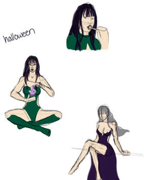
Halloween
|
|
|
Third Piece
|
|
|
|
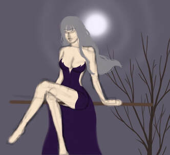
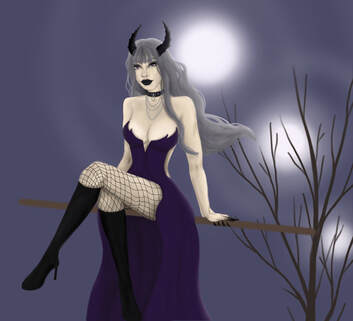
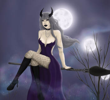
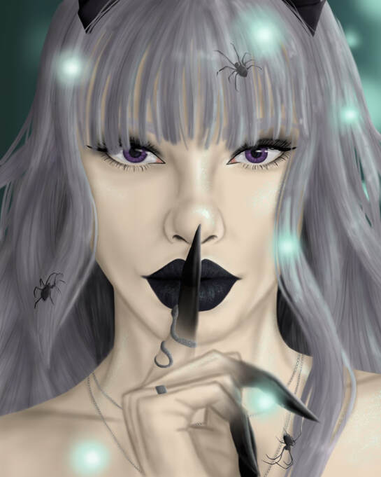
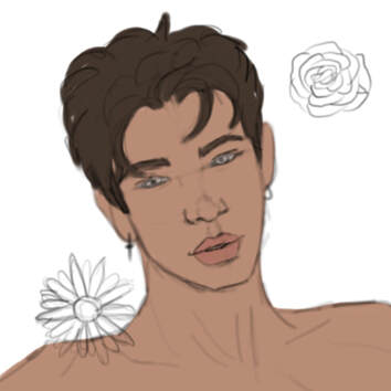
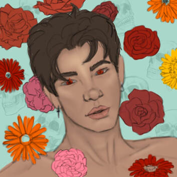
The girl I drew for Halloween is named Eury. She's part demon; named after her father, the Prince of Demons Eurynome. She inherited a few traits from her father, such as sharp fangs, obsidian tipped claws and winding horns. Purple and orange are the two colors associated with halloween, but I decided to focus on the purple since it gave my piece a mysterious and dark vibe.
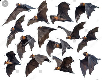
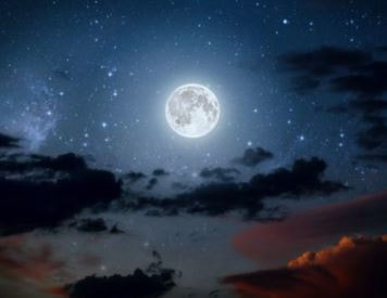
I had a bit of an art block once I finished drawing her, and I didn't know what else to add in the background, but then I had the idea to draw orbs in the trees and some bats flying around. It was fun to draw the bats since I got to mess around with the lighting of the moon and the orbs in the trees. I didn't want to use purple again, and I didn't think orange would fit into my piece at this point, so I used teal as my secondary color. Overall, this is one of my favorite pieces ever and I loved how it turned out. |
|
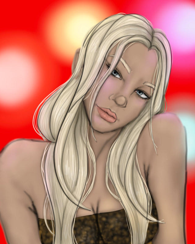
Fourth Piece
|
|
|
|
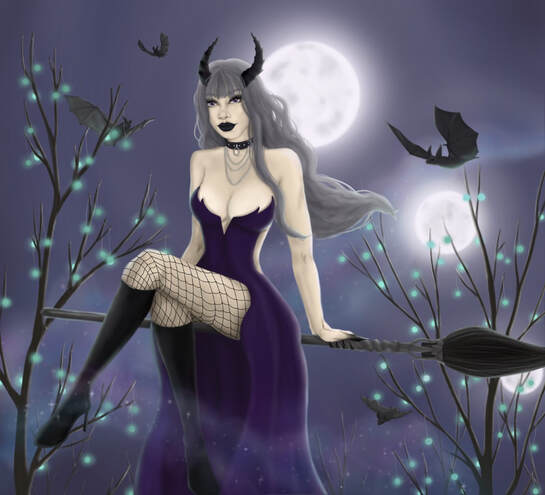
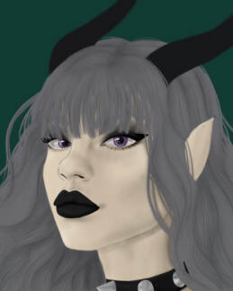
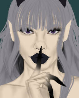
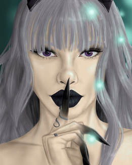
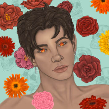
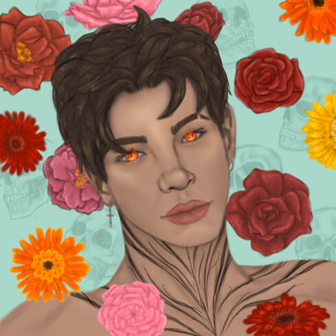
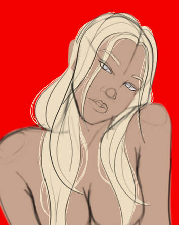
As you can see from the picture in the far left, I originally had a different pose for Eury's portrait, however, I changed it. I liked the pose, but I really wanted to show her hands so the viewer could see the obsidian tipped fingers clearer and I wanted a different vibe from the piece. I drew her with her finger up to her lips to make the piece more mysterious and secretive.
The hardest part of this piece was drawing the hair, since I'm not great at drawing the individual strands close up, and I was struggling with the lighting from the orbs. However, after a few hours, I think it looks decent. I brought the teal orbs from the last drawing into this piece as a different light source. Once I finished drawing Eury, I thought there was still something missing, so I added a few spiders to reiterate the idea of "Halloween". |
|
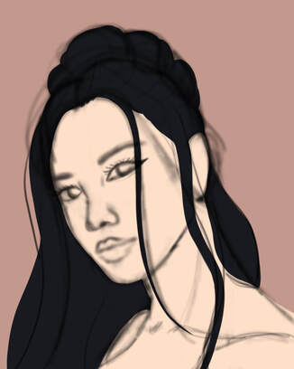
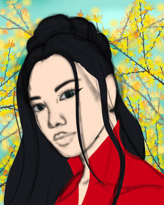
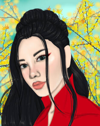
Chinese New Year
|
|
|
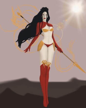
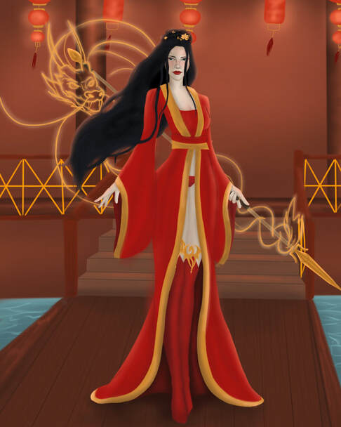
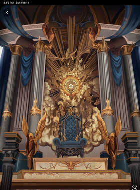
Fifth Piece
|
|
|
|
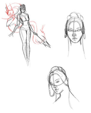
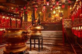
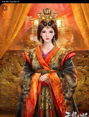
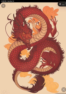
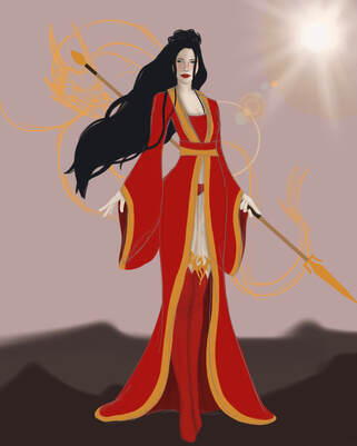
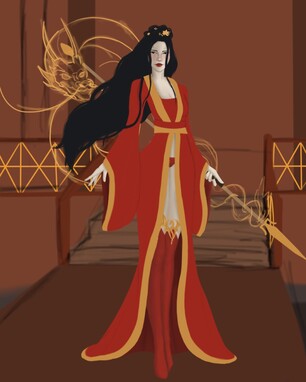
I originally had my character standing outside and in a different outfit, but then I decided to put her in traditional Chinese robes to fit the "theme" of Chinese New Year. She's holding a Chinese Qiang (spear) and has a glowing dragon behind her. The dragon is a sort of spirit guide and aids her in battle and when she needs it.
She was originally outside, maybe in a sort of battle field, but I couldn't think of what to add. Then I had the idea of drawing her in a temple. I continued to use more warm colors for the temple, but I thought it would look good with water on either side of the walkway she was standing on. I might come back to this piece and add more to the background, but I hit an art block so this is the finished piece. |
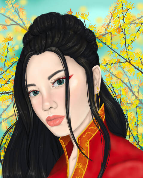
Sixth Piece
|
|
|
|
I didn't want to use red or warm colors for the background, so I went with a light teal for the sky and drew golden larch branches, which is a plant native to China. I really liked the color combination and think it turned out good.
I didn't add any pins in her hair because I wanted to give this piece a softer vibe and to show her sweet side. I think the pose I drew her in also conveys this, and there's a slight breeze, which I showed in her hair. The hardest part of this piece was figuring out what to draw her wearing. I ended up drawing her in robes, like the previous drawing, but these were a different style and had a high collar. It was hard to draw the details on the collar of her robes because I didn't have a reference picture and I couldn't think of any intricate designs, but I drew a few simple flower designs and I think it actually worked out. |
Cinco de Mayo
|
|
|
Seventh Piece
|
|
|
|
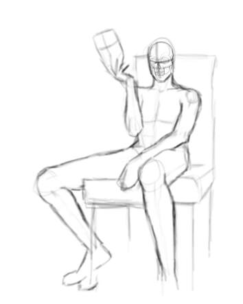
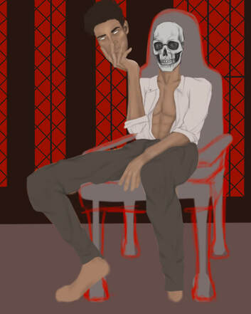
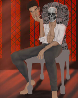
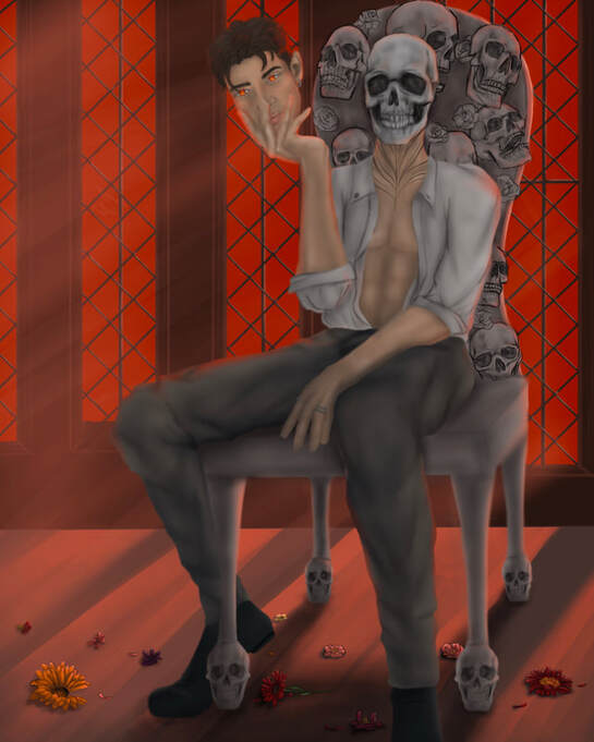
Cinco de Mayo is a bright holiday and its when people remember the time they spent with loved ones that they lost. This drawing isn't really Cinco de Mayo as a person, but I wanted to show a darker view. I drew one of the rulers of the underworld on a throne, and the flowers from the celebration from the overworld scattered on the floor. One tradition of this celebration is to wear face-paint of a sugar skull (a brightly painted skull with decorations) but I wanted to draw the character holding a mask, but the mask wouldn't be a skull; it would be a human face.
I had a really hard time with the proportions and fabric since I don't typically draw men or looser clothing, so I had to use a lot of reference pictures. The lighting was also really hard to do, especially since I had to draw it reflecting off of all the skulls on the throne. |
|
Eighth Piece
|
|
|
|
Using the face of the guy on the mask, I drew the character in his "human form". I wanted to bring the vibrance of the holiday into one of the pieces, so I drew some of the flowers that are used to celebrate the day of the dead around him; falling down. In the background however, you can see the outline of skulls, like the ones from his throne in the first picture.
I had a really fun time drawing the flowers and working with the shadows. I don't normally get to work this up close with flowers, so I enjoyed the opportunity to draw a variety of them. I got to a point where it didn't quite feel finished to me, but then I got the idea of adding a throat tattoo. It's not a specific pattern; it's more of a free flowing design, similar to tendrils of smoke. |
Easter
|
|
|
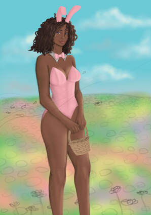
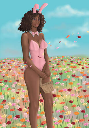
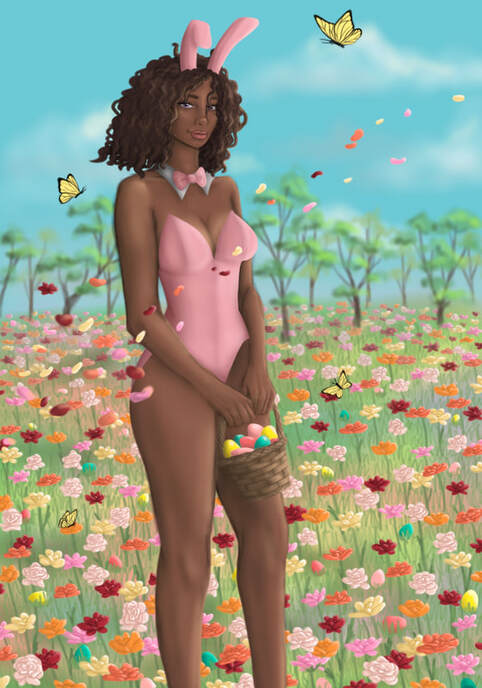
Ninth Piece
|
|
|
|
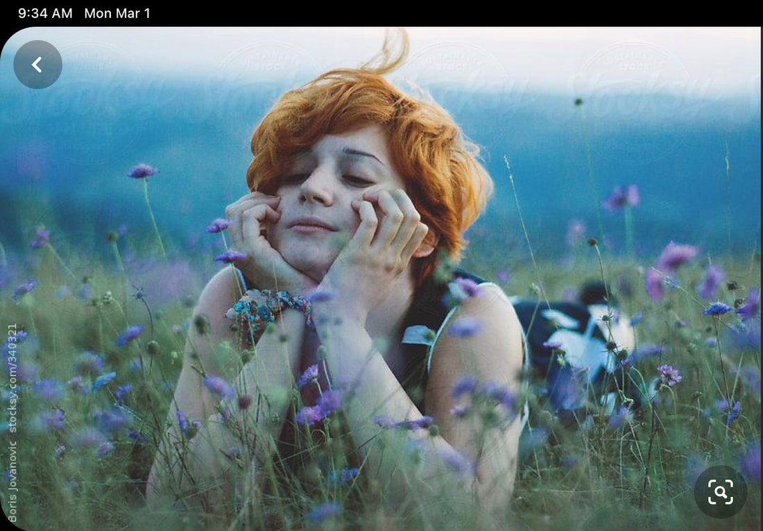
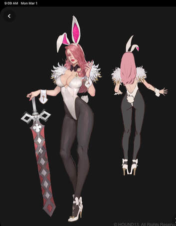
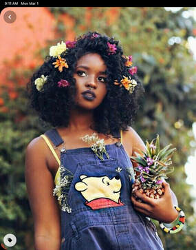
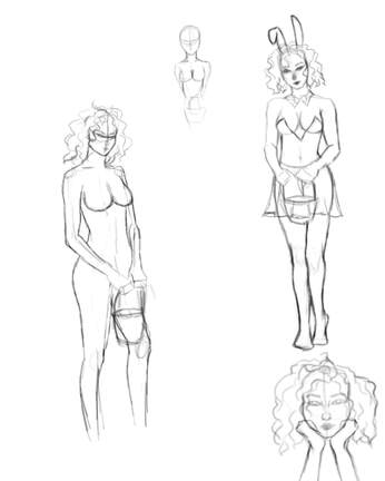
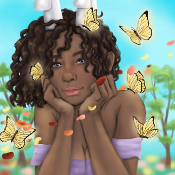
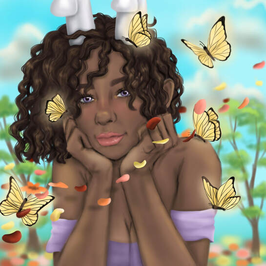
I wanted to have a wider variety of ethnicities in my portfolio, and I thought that a dark skinned girl would look good with the pastels that I associate with Easter. I wanted to draw her holding an Easter basket in a bunny costume and use a lot of bright colors.
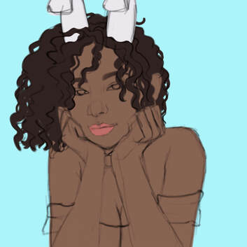
For the background, I wanted a colorful flower field and have some of the petals blowing past her to show movement, since her pose wasn't really dynamic. On the third progress picture, you could see that I hadn't added the trees in the background or the butterflies. I was kind of lost on what to add, but I didn't have any ideas. However, when I was working on the tenth piece, I wanted to add some butterflies and decided to incorporate a few of them into this piece. Someone from my breakout room also suggested adding some trees in the background and I think it filled up the space nicely. The hardest part of this piece was probably just filling all the space, but I had a fun time working with all the bright colors, since my pieces normally have a set color scheme of 2-3 colors. |
|
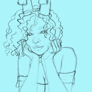
Tenth Piece
|
|
|
|
I wanted a pose that you could look at and see "Spring". I thought that having the girl resting her chin in her palms and making it look like she was laying in the flower field would look super cute, and I liked the composition. I wanted to bring the bunny ears into this piece too, for the Easter theme, but I drew her in a different outfit. I didn't want the only think in the foreground to be her, so I decided to add a few pale yellow butterflies, which I think compliment her skin tone and the lavender color of her shirt well.
I had the most trouble working with the lighting of this piece for some reasons. The shadows were really hard for me but I managed to bring some cooler tones in to contrast the warmer tones of her skin. |
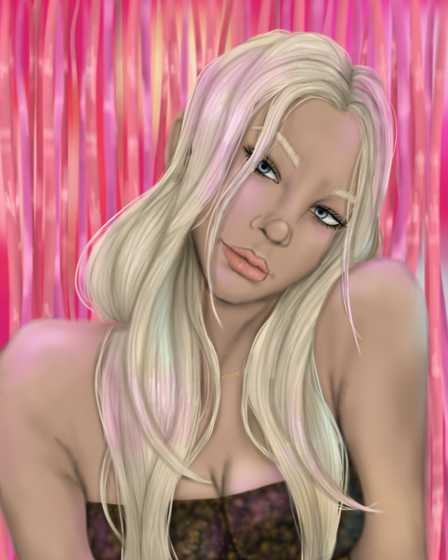
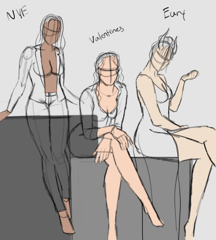
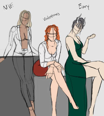
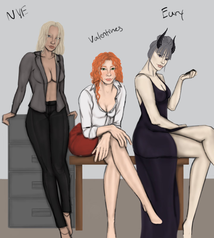
New Years Eve
|
|
|
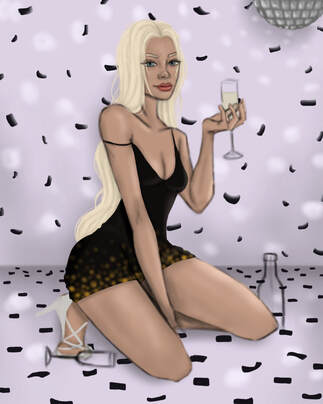
Piece 11
|
|
|
|
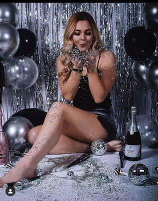
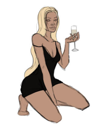
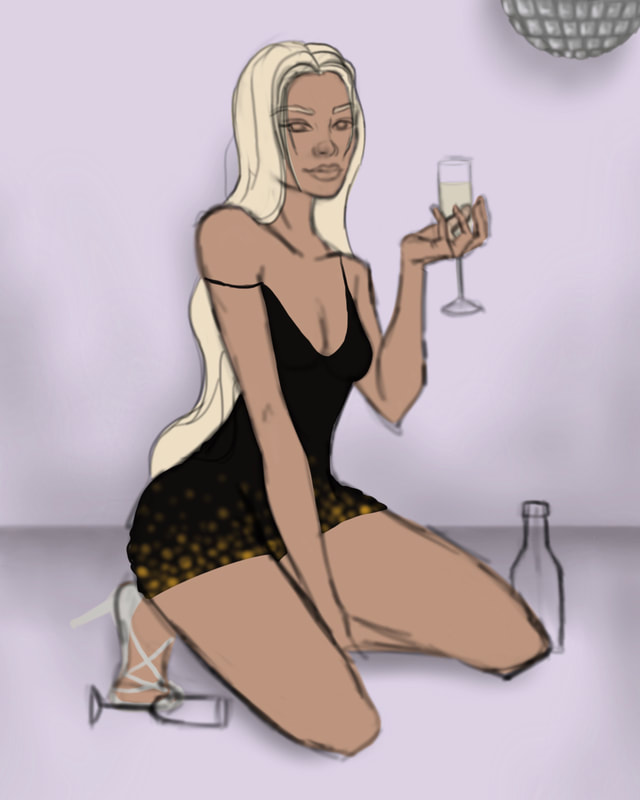
For this piece, I wanted there to be a disco ball so I could work with different lighting and to represent a party. I found some inspiration from one of my photographers' pieces and wanted to use the idea of confetti and champagne, since I thought it would be fitting for New Year's Eve.
Looking back at this piece, I would change a lot of things. Her face is too masculine and doesn't look much like the portrait, but I think I could fix that if I sharpened her jawline and moved it up a bit. If I had more time, I would've studied hands a bit more and drew her hand resting on her thigh instead of hiding it. Other than that, I liked the composition of this piece and the lighting and champagne glasses were fun to work on. Loo |
|
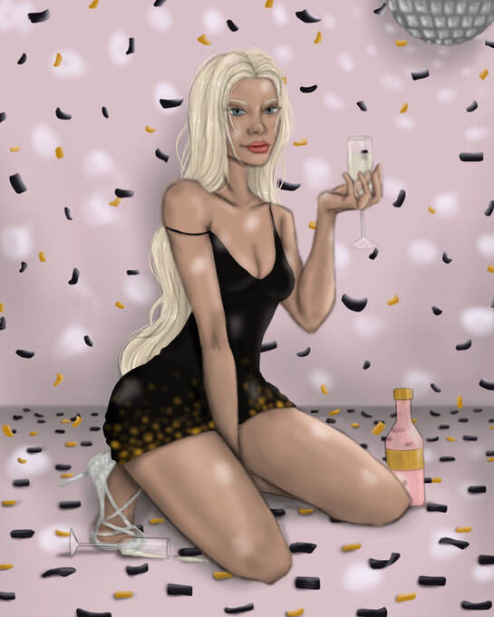
Piece 12
|
|
|
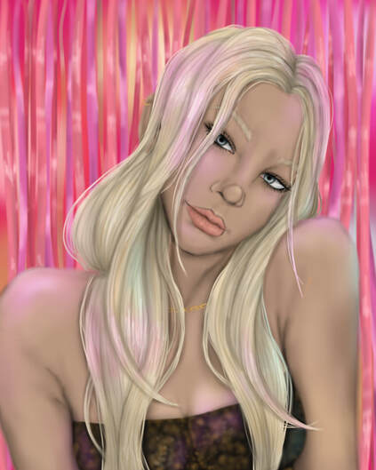
|
I prefer New Year's portrait over her full body pose, since I was able to draw her as I pictured. Originally, I was just going to have lights in the background to keep the party theme, but then I decided that adding reflective streamers could be more interesting.
The shading on her nose is a bit off and I think I could've darkened her skin in a few places, but besides those minor details, I really like this piece. I stuck with the black and gold color schemes but added pink in for a brighter vibe and for the contrast. |
Christmas
Piece 13
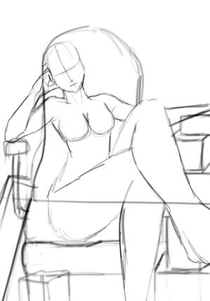
|
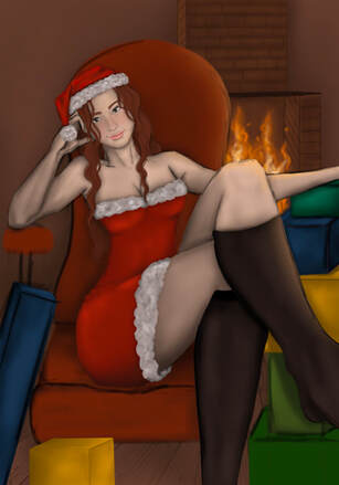
|
|
|
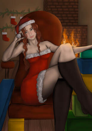
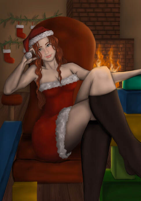
It took me a while to come up with a pose for Christmas. I wanted something to show warmth but also still being dynamic. Originally I drew her in a Christmas box of some sort from a top view with her legs hanging out of the side, but I didn't like that concept when I started sketching it.
Then I had the idea of drawing her in a padded chair in front of a fireplace leaning against presents. I used the warm smoky tones to create a Christmas feel and stuck with different shades of red for my palette. I was really struggling with the perspective and how to draw the fireplace, but I finally got my point of vanishing and horizon line to a place where I liked, and then I had a lot more fun adding in the shadows. Overall, I really like this piece and think the lighting shows progress from my first few pieces. |
|
Piece 14
|
|

|
|
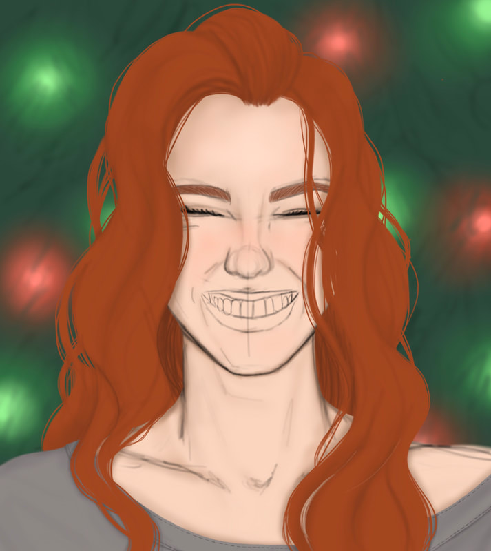
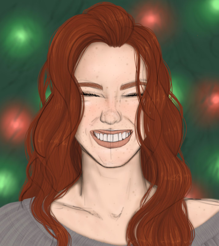
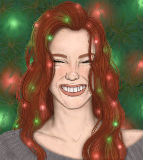
Unlike my previous portrait drawings, I wanted this one to be very expressionate. Christmas is one of my favorite holidays and I wanted to convey the excitement and energy I feel. I'm normally not good at drawing people smiling, but my skills have improved and I love how this piece turned out.
I wanted her to be wearing a loose grey woven sweater, since I feel like Christmas would wear something cozy and warm. I chose grey because I wanted there to be a neutral color and prevent too much contrast between the color of her hair and the background. I thought little lights in her hair would be a cute touch and it helped bring the background into the foreground in a cohesive way. If I had more time, the only thing I would change about this piece is the background. I would look up more references for fir tree branches and go into more detail. |
Piece 15
|
|
|
|
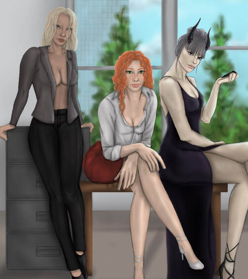
This last piece was fun for me to do, since I was able to combine a few of my favorite holidays, but I also hate how it turned out. I had such a hard time with the lighting and since I'm less familiar drawing New Years and Valentines, I struggled to make their faces match the original drawings of them. Eury, my Halloween girl, was a lot easier for me to draw, since she's my main oc and I've drawn her on various occasions. I liked the concept of this piece and the more neutral background allowed the colors of my characters to stand out but not interfere.
If I was to redo this piece, I would make another light source, since I haven't had enough experience working with back lighting. The shadows are better than they were before but I really dislike this piece, even though the original concept was nice. |
|
