Drawing
Contour Hand Drawing
|
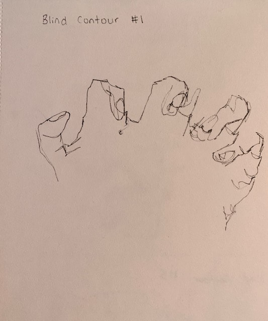
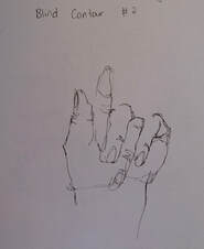
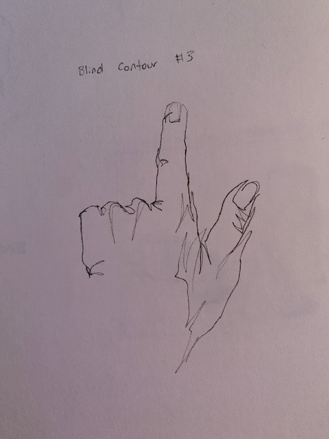
These 3 drawings were blind contour drawings. I didn't look at the paper, just my hand. As the drawings continued, the proportions improved
|
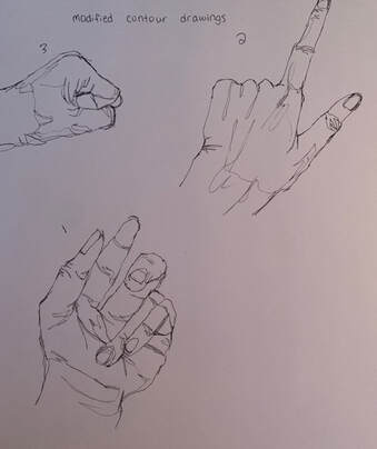
These were the 3 modified contour drawings. This time, I looked at my paper as I was drawing, but I still didn't take the pen off the paper.
|
|
|
|
|
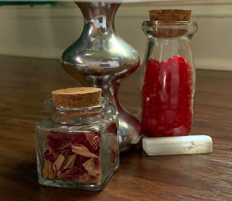
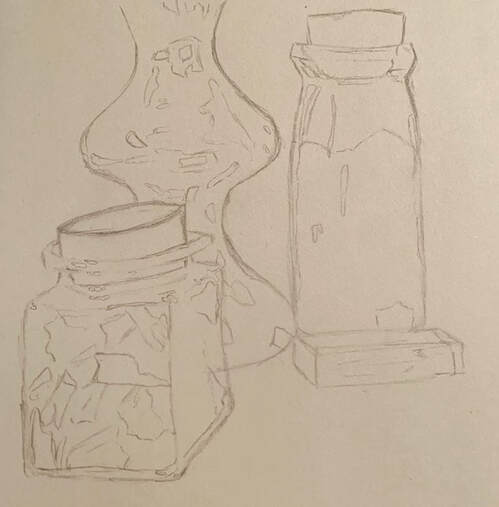
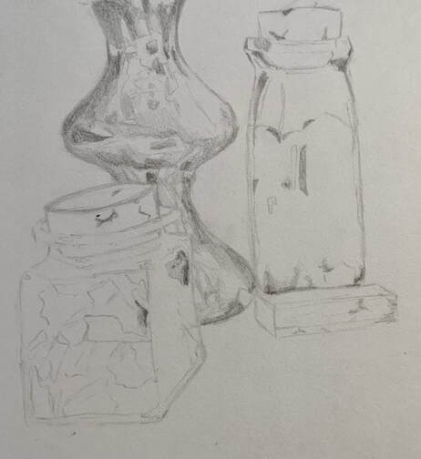
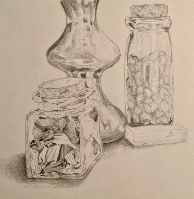
Final Still Life Drawing
|
|
|
|
|
- 4. How important were the compositional sketches? Explain.
- 5. How is your final drawing successful?
- 6. Are the proportions, structure and perspective of the subject correct?
- 7. Does the placement & grouping of objects create a pleasing arrangement (composition)?
- 8. Is there a center of interest and is it well located?
- 9. How well did you manage your time and resources throughout the process of creating this drawing? Do you see where you could improve in this area?
- 10. What challenges did you encounter during this project and how did you overcome them?
- 11. What have you learned drawing a still life?
Perspective
One Point Perspective
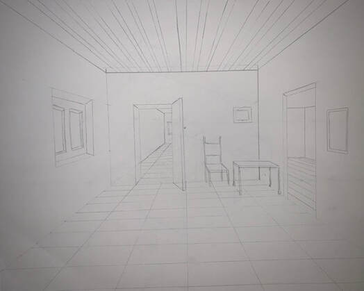
In this piece, the point of view is a person standing in a room, towards the back. You're looking forward, where the vanishing point is.
|
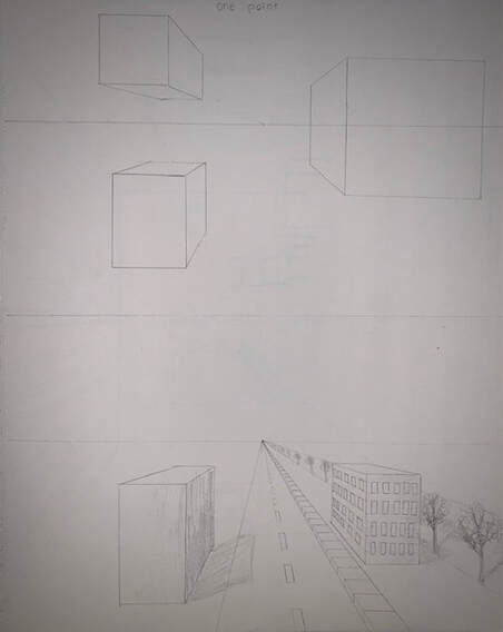
The top drawing is just shapes we copied from the video, showing us how perspective works. The bottom drawing is a one point street view.
|
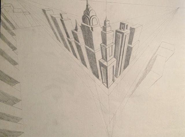
Two Point Perspective
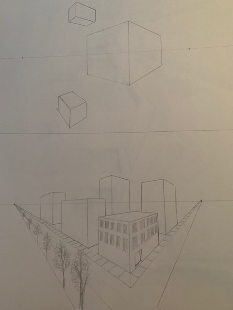
The top drawing is more shapes to teach us how two point perspective works, and the bottom drawing is a city/street view with two vanishing points.
|
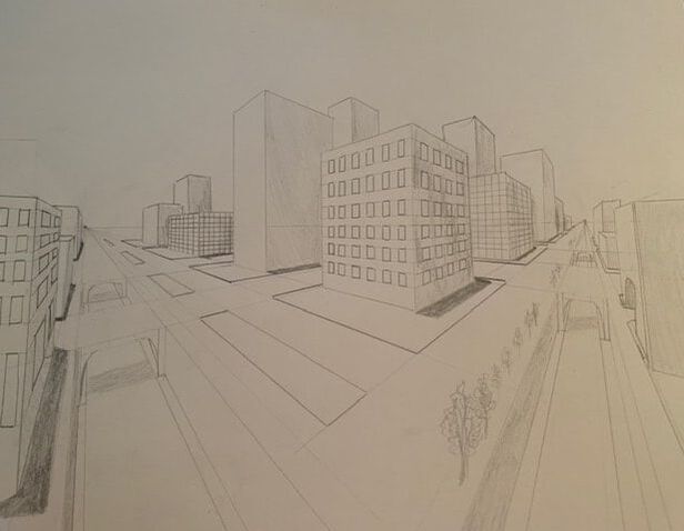
This is a more in-depth city drawing with 2 vanishing points. The light source is on the left, which casts the shadows to the right.
|
Three Point Perspective
I didn't get to finish this drawing due to the amount of buildings and details.
|
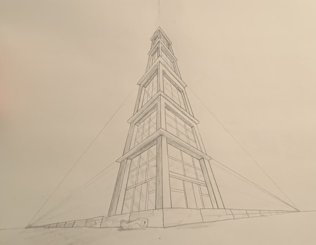
This was my second three point perspective drawing and I actually enjoyed it. I thought it was cool and fun to draw
|
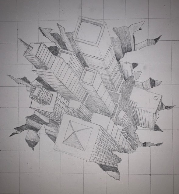
This one took me a long time to draw, but it was fun. It was confusing because I think I missed where the third vanishing point was supposed to be, but I think it turned out good anyway.
|
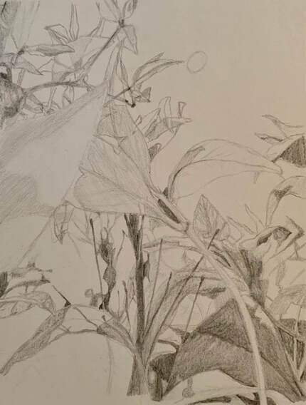
Forced Perspective Assignment
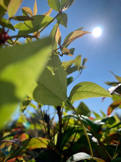
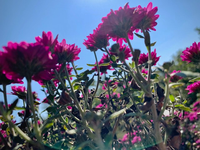
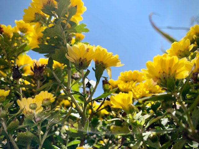
Reference Photo
|
|
|
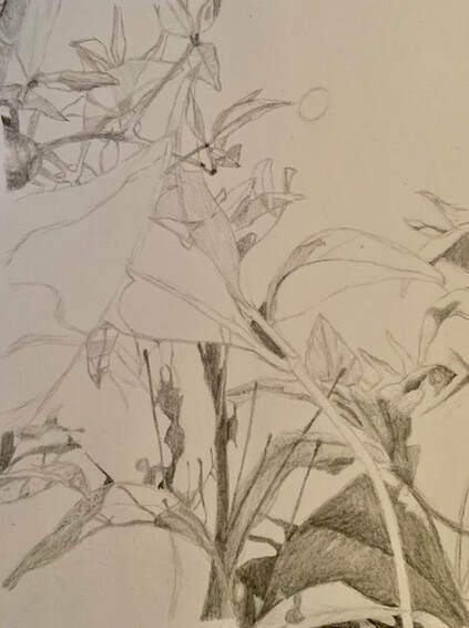
In Progress Photos
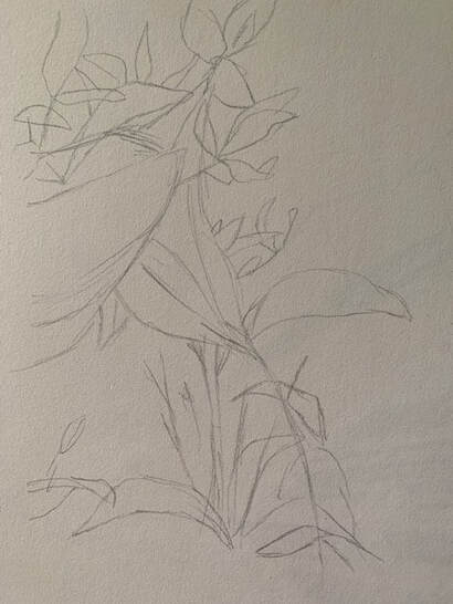
|
|
|
Final Drawing
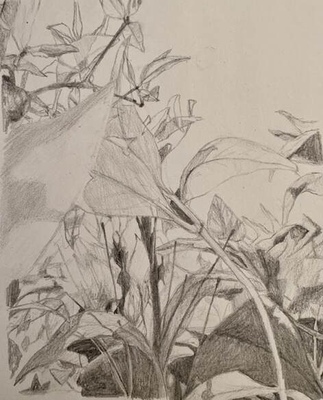
|
1. Describe how you created an interesting point of view. Was it successful? Why or why not?
To get this specific point of view, I put my phone in a bush and angled it upwards. I thought it was an interesting point of view, one that we don't typically see. 2. Why is it important to understand perspective and how to draw it? It's important to understand perspective because whether you notice it or not, it's in everywhere. We look at the world in different perspectives and being able to capture that in a drawing makes it more lifelike. 3. How were the pencil and perspective exercises important in the success of your piece? It was important to know that things that are farther away tend to be smaller and the angles are different when there's a vanishing point. 4. Describe the craftsmanship of your perspective. What techniques were used? I made the leaves in the background darker than the leaves in the foreground to create depth and overlap. The angle that I took the picture at showed perspective. 5. Were you able to achieve depth by showing a foreground, middle ground, and background? Explain. Yes, I was able to achieve depth. In my drawing, you can tell which leaves were in the background, and which were closer to the camera. Unfortunately, it was hard for me to show the separate foreground, middle ground, and background using just one color. 6. Explain your experience with using perspective and the project in general. What were the obstacles and advantages? I did many one point, two point, and a few three point perspective drawings before I started this final project. They took a lot of time, but I don't know how much they helped me for my specific drawing, since there wasn't a specific vanishing point. 7. Looking back on the progression of this project, what skills, techniques, or other information would you like to have been taught? Do you feel you were prepared for this project? I think we were taught well, and our practice drawings prepared us for the graphite still life/forced perspective drawings. Personally, I felt prepared going into this project, but I didn't really like the outcome because the depth was hard to draw with just graphite. |
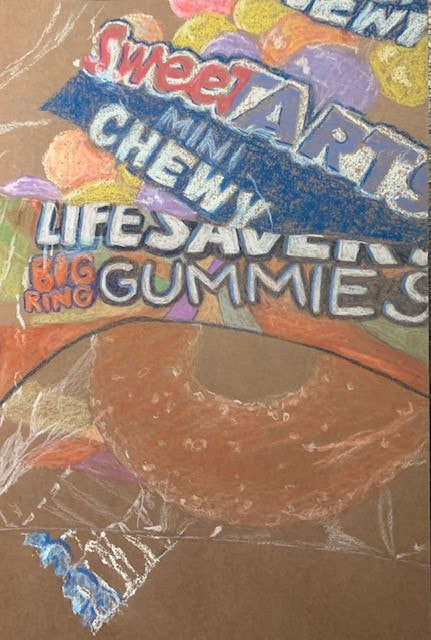
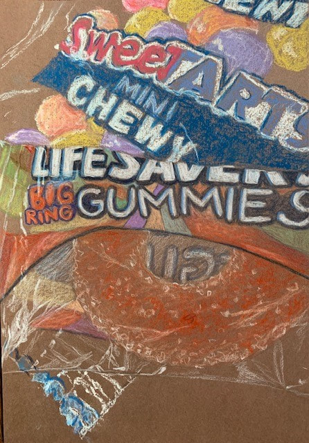
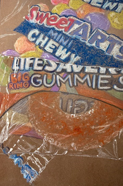
Candy Drawing
|
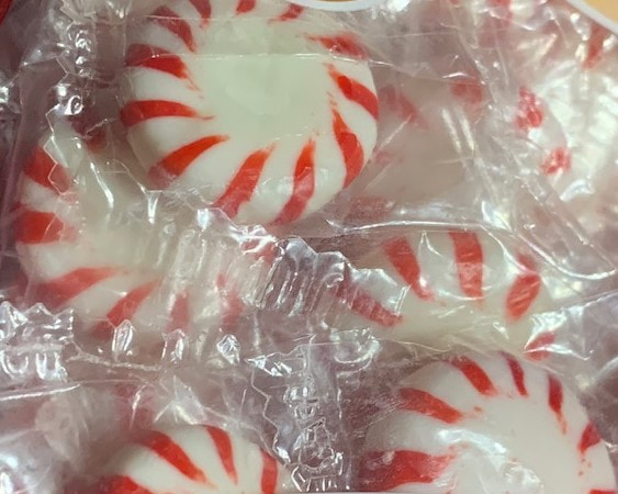
Reference
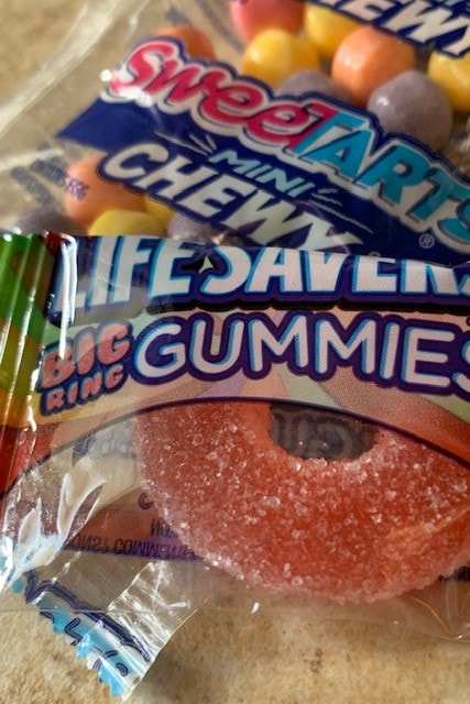
|
|
|
|
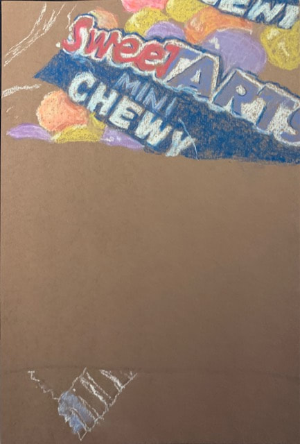
Final
|
1. Explain how value is important in this drawing.
Value is important in this drawing because it shows contrast and allows you to distinguish the depth of the piece. 2. Describe several challenges that you faced while creating this drawing. What did you do to overcome these obstacles? It was really hard for me to get the color that I needed for the SweeTarts because I hate pastels. Eventually I was able to get the hue I needed by blending different colors together, but it was difficult. It was also hard to get clean lines with the pastels. 3. How important was it to have clean crisp edges to your wrapper? It was really important to have clean lines to outline the wrapper so you could tell the difference between the two pieces. For the Lifesavers wrapper, I went over the lines with a white gel pen to make the lines more defined. 4. Explain how your interpretation of texture is essential in capturing the look of the object. Texture is very important, and it was especially important in drawing this piece. I had to make the wrapper look realistic and add the white highlights, but also making sure that they looked real. Seeing all the different layers of the candy itself was difficult, but I managed. 5. Name three things you would draw differently if you were to do this project again. What did you learn from this drawing? I would use my tanned paper instead of this drawing paper, only use prismacolors, and go back in with the white gel pen again for more highlights. I learned that it's very hard to draw clear objects with pastels, and that white gel pens are a godsend. |
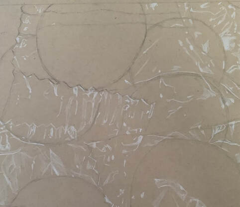
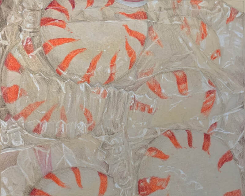
Look What I Can See Through
|
Reference Photo
|
|
Progress Photos
|
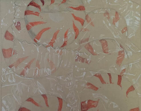
|
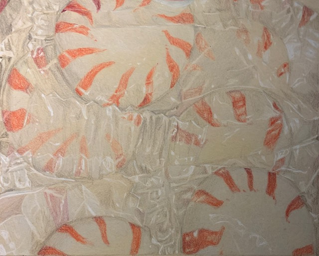
|
|
1. Describe the craftsmanship of your drawing. (Is it neat and well executed?)
I think my drawing could've been cleaner and gone in more with the shadows, but overall, I think the craftsmanship is good and I put a lot of time into this piece. 2. Describe how you created the look of transparence. I had to use a lot of greys and whites to make the piece look transparent. It was hard because I didn't want to make the shadows too deep. 3. Describe your choice of colors/color harmonies and how you used them throughout the artwork. I used blood red, neon orange, burgundy, and many shades of grey and brown for this piece. The reds were a combination of warm and cool tones so I had to use many colors. 4. How did you create contrast in your drawing? I created contrast in my drawing by using a variety of greys and browns for the shadows, and used a white gel pen for the highlights to create depth. 5. How did you use textures, highlights and shadows to enhance your artwork? Without the highlights or shadows, my piece would look very flat and there would be no illusion of transparency. 6. Discuss the importance of understanding the media (prisma or pastels) and acquiring the skills necessary to create a successful project. How beneficial were the mini assignments? Since I've used prismacolors before, I knew how to layer them and what colors give me certain values. The mini assignments were super helpful to me since I already knew how to use prismacolors. 7. Describe any difficulties you had creating your drawing and what you could do to improve your drawing? It was hard for me to get the shades of red right, for some reason. And the shadows weren't dark enough, but that's because I'm scared of making them too dark and making the piece look 3D. Next time, I would use some darker shades of red and browns for the edges of the peppermints. |
Portrait Work
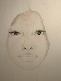
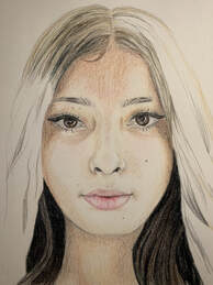
Portrait Practice
|
|
|
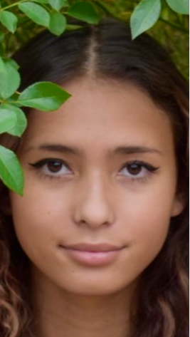
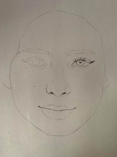
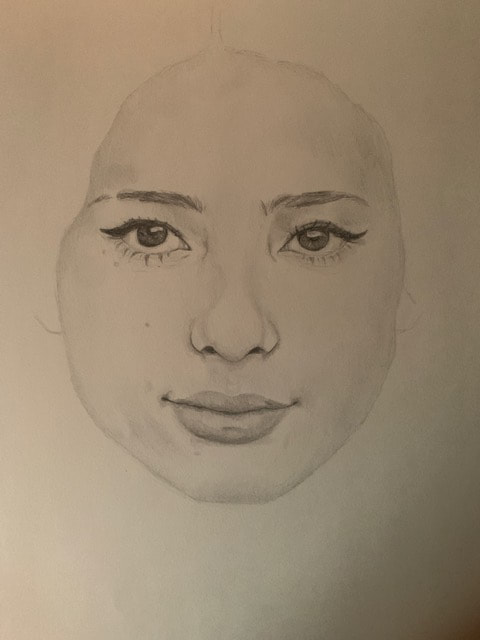
Portrait Final
|
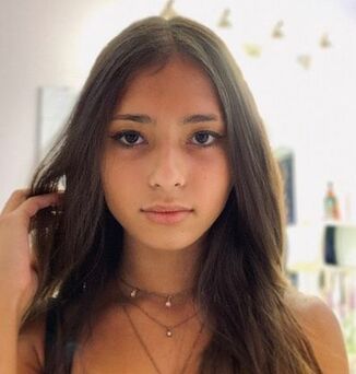
Reference
|
|
|
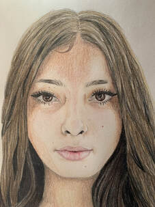
|
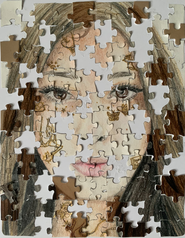
|
1. Explain the process you went through to develop your drawing.
When I was brainstorming ideas, I had to think of something unique and had to create a piece that showed who I am. I settled on 2 ideas; a drawing of me with puzzle pieces with a few missing, and one with gold tattoos symbolizing certain parts of my life. I ended up combining both of these ideas into one. 2. Discuss your choice of how you represented yourself (mechanical, expressive, stitched together, etc)? I drew small things that represented who I am on my skin, like tattoos. I drew butterflies to show the butterflies we released at my cousins funeral, a paw-print to show my love for animals, a boxing glove because I do kick boxing, a music note for the violin I played for many years, a book for my love for reading, a maple leaf and Chinese dragon to show who I am, and a pose of me doing aerial sling. 3. Did you achieve a full range of value within your portrait? How? I used different prismacolor pencils to get darker and lighter values throughout my piece. I used my colorless colored pencil to burnish and have the colors more vibrant. 4. Describe your craftsmanship. Is the artwork executed and crafted neatly? Yes, I think there are things I could have done a bit better, such as the placement of the tattoos, but I think it was executed well. 5. How were you able to capture your look? I had to do many sketches but I've drawn self-portraits before so I knew how to convey myself through my art. 6. Explain how you made sure you had correct facial feature placement. I just had to keep referencing the picture I was going off of, and taking a step back. 7. Explain the importance of learning how to draw all the features individually. Even if you get the features in the right place, that doesn't necessarily they will look good. Knowing how to draw the features means that when you put them all together, it will look realistic. 8. What part of this unit was the most beneficial and why? Drawing the nose was probably the most helpful because I draw a certain type of nose and I haven't really looked at mine much. 529. 9. List any obstacles you had to overcome and how you dealt with them. It was hard trying to get the gold tattoos to really stand out, so I ended up going over the metallic gold paint with a micron pen, then back over with the gold paint so that it stood out against my skin tone. |
 RSS Feed
